Skin Specification
What’s a source bitmap
Source bitmap is a bitmap file (.bmp) which can be compiled to a skin file. SkinBuilder for Sunisoft Skin Solutions v2 uses a kind of special specification bitmap file as the input and compile it to a skin file. The bitmap file includes all elements of a skin. It means that the UI/skin designer just need to design all elements for your skin and draw all elements into a single bitmap file, then SkinBuilder can convert it to a skin file which can be used by developers.
The specification of source bitmap
At first, the source bitmap should be in 24bit color mode. No restrict for the size (Width and Height) of the bitmap.
There are 2 types of elements: color and image. For color elements, use a ‘color block’ to define them in the source bitmap. The ‘color block’ is a square at 16*16 pixels size. With SkinBuilder tool, you can draw a color block with ease. For image elements, just draw them directly in the source bitmap with some restricts. Elements are separated by a background color line.
The elements defined in source bitmap includes:
Predefined Colors
Form Elements
Buttons Elements
Controls Elements
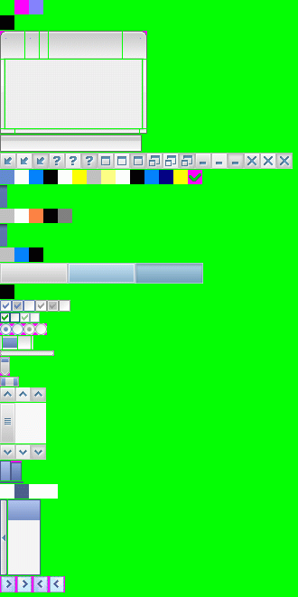
Below is an example of a full source bitmap:
Predefined Colors
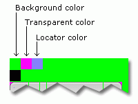
At first, you need to draw 3 color blocks at the first line of the source bitmap to define 3 colors witch will be used for the source bitmap itself. After defined, the 3 colors will be used in special way and you can’t use them for any other elements. They are:
-
Background color
It’s a color to define the background color of the entire source bitmap. It means that the compiler of SkinBuilder will ignore all regions in this color and treat them as the separator of elements. -
Transparent color
This color is defined for the transparent region in image elements. -
Locator color
This color is used to specify the position of points in image elements. E.g. you need to specify the position of the caption in the title bar of the window.
Below is a segment for predefined colors in source bitmap:
Form Elements
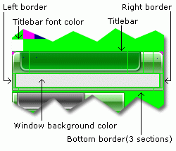
- Window
- Titlebar Font Color (Type: Color)The font color of the caption on title bar.
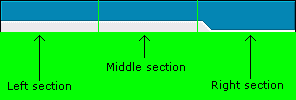
- Titlebar (Type: Image)Sunisoft Skin Solutions v2 supports 2 modes of the title bar definiens: 3 sections and 5 sections.
- For 3 sections mode, a titlebar image is separated into 3 parts. Part #1 is ‘left section’, which will be painted on the left side of the title bar with original size. Part #2 is ‘middle section’, which will be stretch(horizontal) painted on the middle part of the title bar between left section and right section. Part #3 is ‘right section’, which will be painted on the right side of the title bar with original size.An example of 3 sections mode titlebar:
- Left/Right Border (Type: Image)Left and right border of window, will be stretch(vertical) painted. The client area of window, will be filled with the color which you define between the left and right borders.
- Bottom Border (Type: Image)You can separate the bottom border into 3 parts manually. If not, then the compiler of SkinBuilder will separate it automatically, it means that the 3 parts will have same width.
- Icon/ControlBox PositionIn ‘left section’ of titlebar, you need to draw a point with Locator color to point out the position of application icon/control box.
- Caption TopIn ‘caption section’ (5 sections mode) or ‘middle section’ (3 sections mode), you need to draw point with Locator color to point out the top of the caption.
- Titlebar Buttons PositionIn ‘right section’, you need to draw a point with Locator color to point out the position of titlebar buttons(Close, Maximize, Minimize, etc.).
Below is an example of the window elements:
- Minimized Titlebar (Type: Image)This image will be used for a minimized MDI child form in MDI applications.
- Titlebar Buttons (Type: Image)This image defines the title buttons (E.g. Close, Maximize, Minimize, etc.). It includes six buttons definitions – System menu, Help, Maximize, Restore, Minimize, Close. And each button definition includes three statuses – Normal, Mouse hover and Mouse down.Below is an example for titlebar buttons:
- Menu Colors (Type: Color)Menubar start color
Menubar end color (Only for gradient mode. If use solid color, just specify it same as the start color)
Selected top-level menu item color
Selected top-level menu item border color
Selected top-level menu item font color
Unselected top-level menu item font color
Icons bar start color
Icons bar end color (Only for gradient mode. If use solid color, just specify it same as the start color)
Unselected menu item color
Unselected menu item font color
Selected menu item color
Selected menu item border color
Selected menu item font color
Icon for checked menu item (16*16)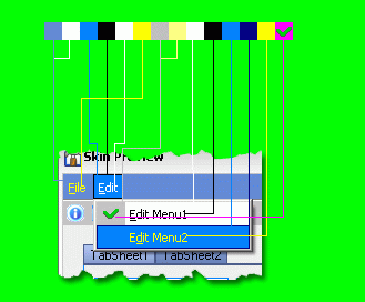
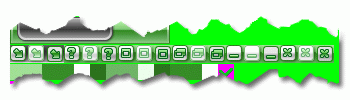
- Menubar Image (Type: Image)If you want to use a background image for menubar, define it here, then the ‘Menubar start color’ and ‘Menubar end color’ will be ingnored. If you want to use color mode rather than image mode, just draw a color block with transparent color.
- Toolbar Colors (Type: Color)Toolbar start colorToolbar end color (Only for gradient mode. If use solid color, just specify it same as the start color)
Toolbar buttons color (Mouse hover)
Toolbar buttons border color
Toolbar buttons color (Mouse down) - Toolbar Image (Type: Image)If you want to use a background image for toolbar, define it here, then the ‘Toolbar start color’ and ‘Toolbar end color’ will be ingnored. If you want to use color mode rather than image mode, just draw a color block with transparent color.
- Controls Colors (Type: Color)These colors are used for normal controls which are not be defined in this specification.
Control color
Control border color
Control caption font color
Buttons Elements
- Button (Type: Image)A single image for consecutive 3 status of button: Normal, Mouse hover, Mouse down. The height and the width of each status must be an odd number.An example of button element:
- Button Font Color (Type: Color)The color of button caption font
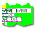
- CheckBox (Type: Image)A single image for consecutive 6 status of checkbox: Enabled checked, Enabled indeterminate, Enabled unchecked, Disabled checked, Disabled indeterminate, Disabled unchecked.
- CheckBoxList (Type: Image)A single image for consecutive 4 status of checkboxlist: Enabled checked, Enabled unchecked, Disabled checked, Disabled unchecked.
The size of each status muse be 11*11 - RadioButton (Type: Image)A single image for consecutive 4 status of radiobutton: Enabled checked, Enabled unchecked, Disabled checked, Disabled unchecked.
An example for CheckBox, CheckBoxList, RadioButton:
Controls Elements
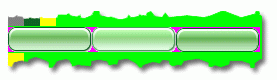
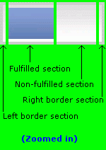
- ProgressBar (Type: Image)
- Left border sectionThis part will be painted as the left(for horizontal progress bar) or bottom(for vertical progressbar) border in original width.
- Fulfilled sectionThis part will be stretch painted as fulfilled region of a progress bar.
- Nonfulfilled sectionThis part will be stretch painted as non-fulfilled region of a progress bar.
- Right border sectionThis part will be painted as the right(for horizontal progress bar) or top(for vertical progressbar) border in original width.For all sections above, the top 2 lines and bottom 2 lines pixels will be treated as top/bottom(for horizontal progress bar) or left/right(for vertical progressbar) border automatically.An example:
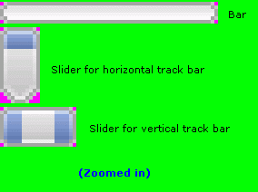
- TrackBar (Type: Image)
- BarIt will be separated into 3 parts automatically. The 3 parts will have the same width value. So you need to ensure the width of the full image can be divide by 3 exactly(E.g. 12, 15 or 51, etc.). Part #1 and part #3 will be painted in original size and part #2 will be stretch painted between part #1 and part #3.
- Slider for horizontal track bar
- Slider for vertical track barAn example:
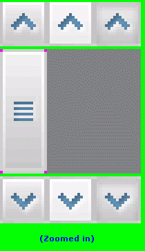
- ScrollBar (Type: Image)
- Up/Right buttonA single image for consecutive 3 status of button: Normal, Mouse hover, Mouse down.
- SliderPart #1 is the image of the slider and the other 2 parts are the background color of the scrollbar.
- Down/Left buttonA single image for consecutive 3 status of button: Normal, Mouse hover, Mouse down.
An example:
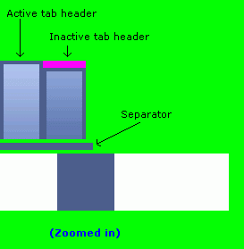
- TabControl (Type: Image)
- HeaderA single image for consecutive 2 status of tab header:Active, Inactive. The width of each status muse can be divide by 3 exactly.
- SeparatorA separator between tab header and tab sheets.
- Control colorsThe background color of tab sheets
The border color of tab sheets
The font color of active tab header
The font color of inactive tab headerAn example: